GRaphic design at
arizona state university
Currently in my second year at Arizona State University pursuing a degree in Graphic Design, I’ve developed a strong understanding of visual communication through various projects. Incorporating key elements like typography, color theory, composition and branding have become central to my design craft. Hands-on experiences such as designing a custom font, drawing objects in 3D perspective, and exploring digital illustration techniques have further sharpened my skills. These experiences have significantly enhanced my design skills and I’m excited to continue developing my craft throughout these next two years.
To highlight some of my work, below is an overview of the process behind several projects I’ve completed.
Gradation project
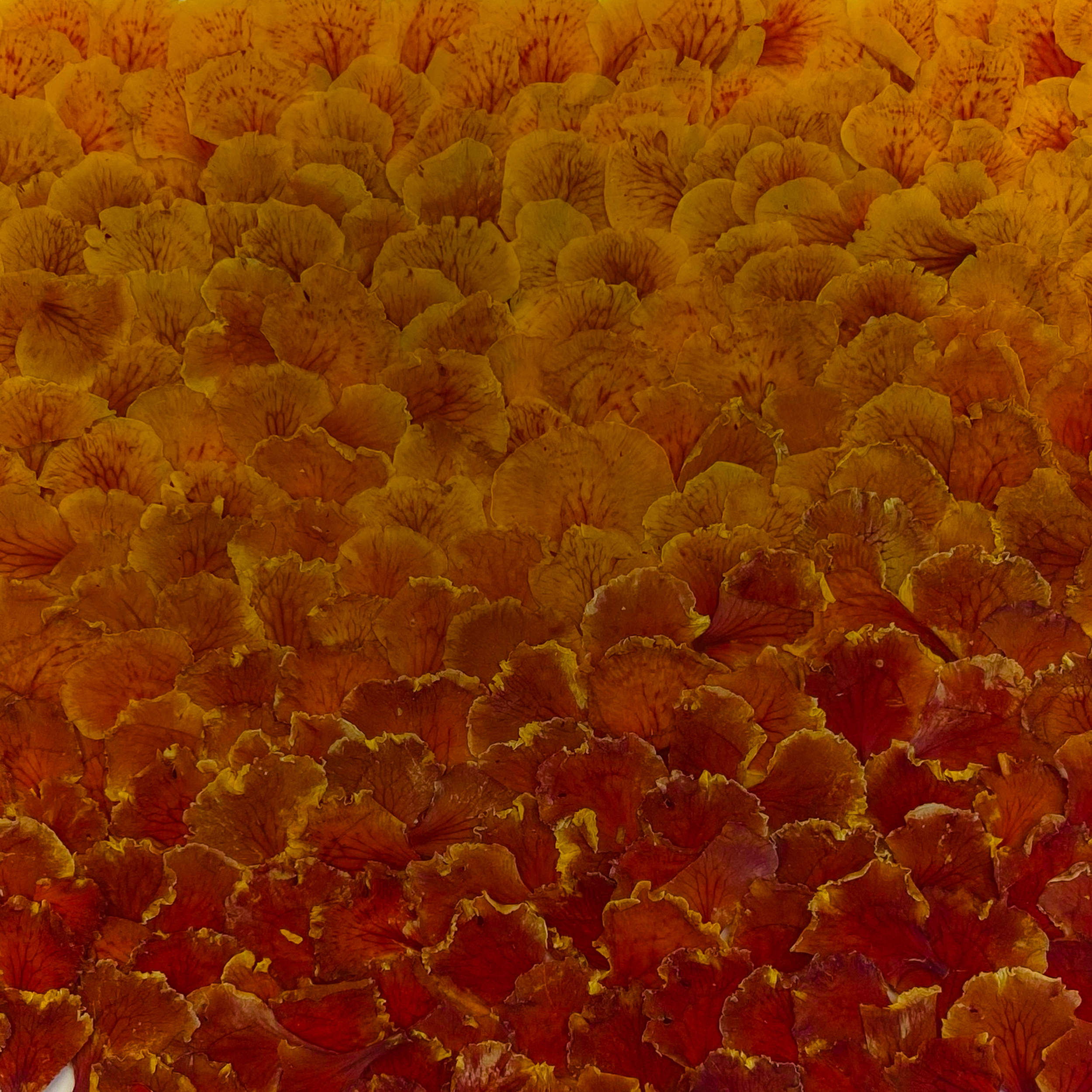
Red Birds of Paradise Caesalpinia-Pulcherrima


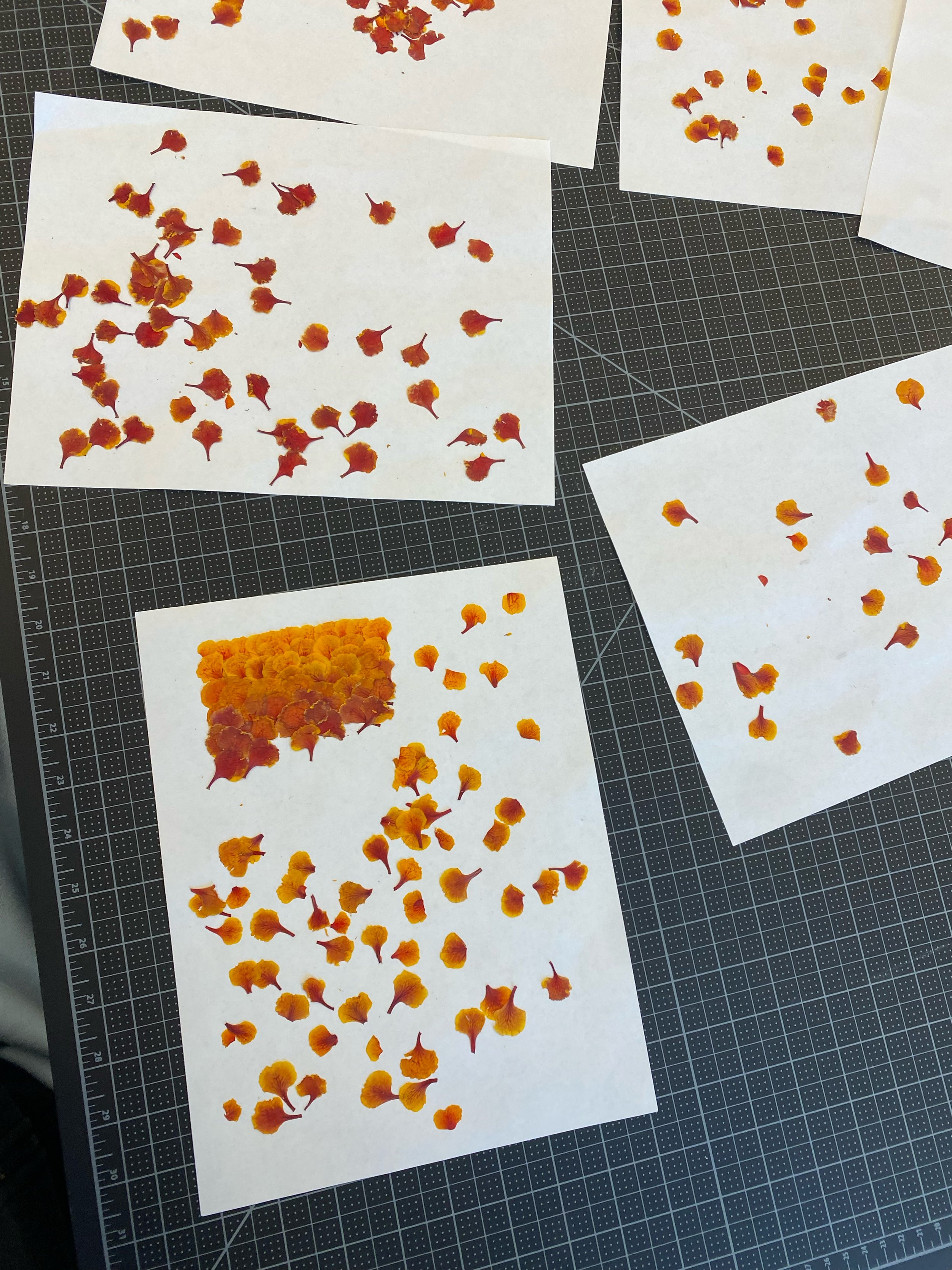

Petals were pressed and dried between two pieces of paper for 7 days to preserve color

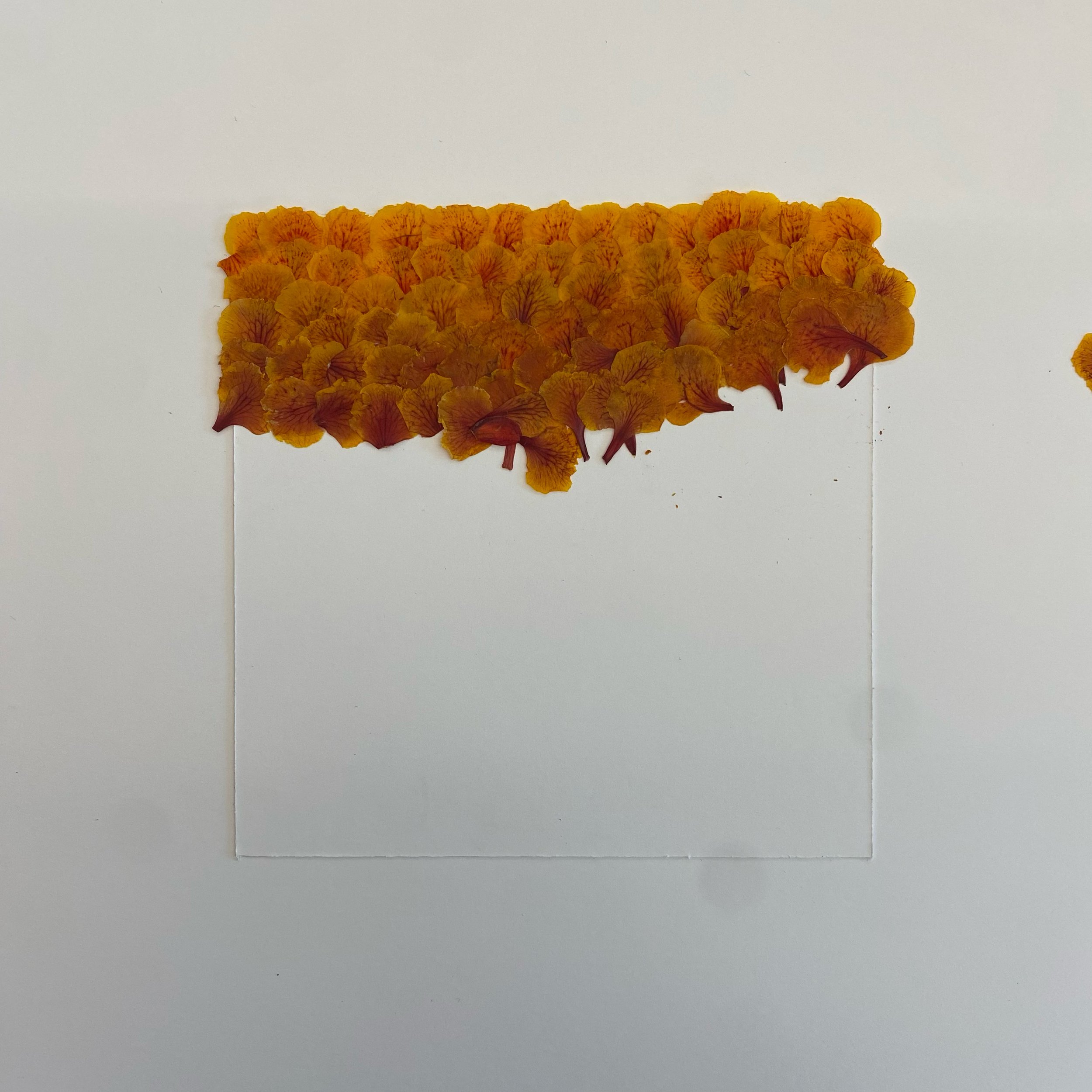


Petals were then arranged too show a gradation between two different hues of color


Inside square was made using the small leafs of the carnation plant

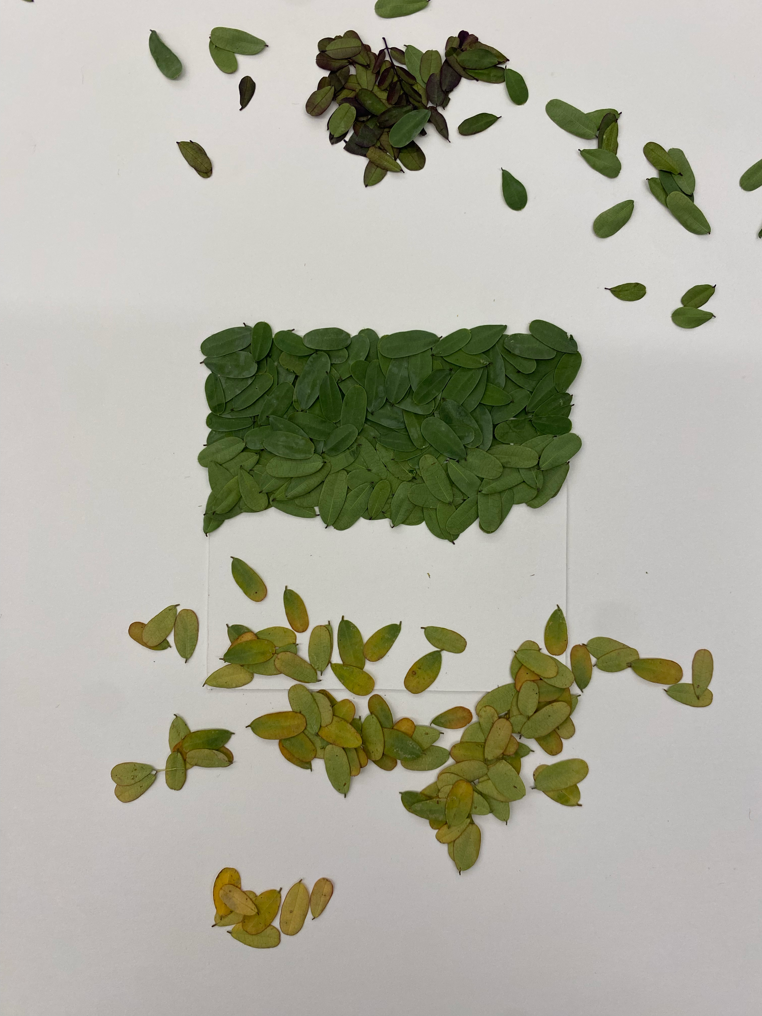

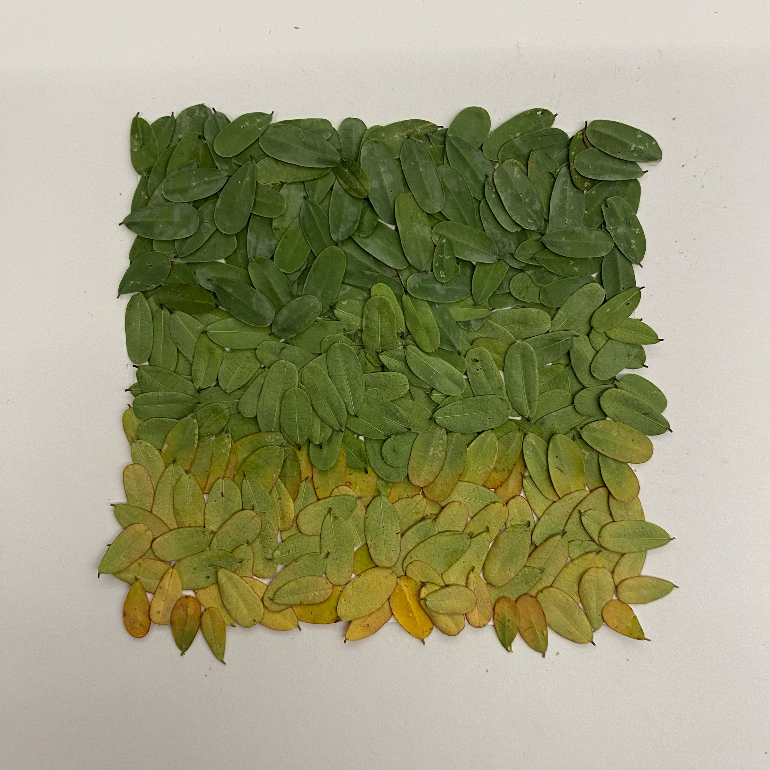
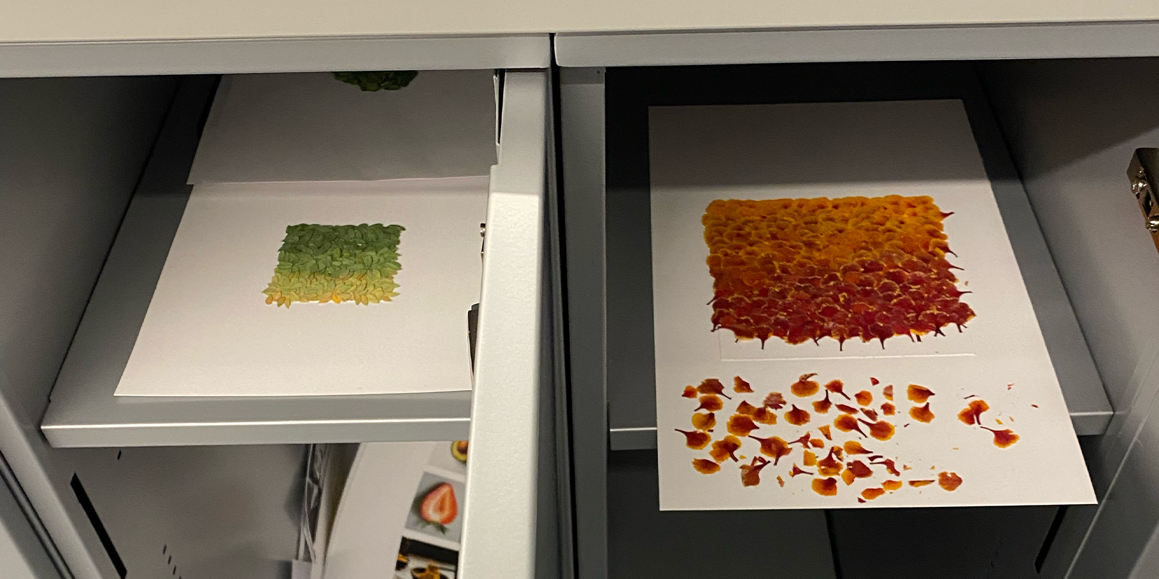
After each class, both canvases were carefully transported to my locker, as the leaves couldn't be glued down due to their brittleness and delicacy.
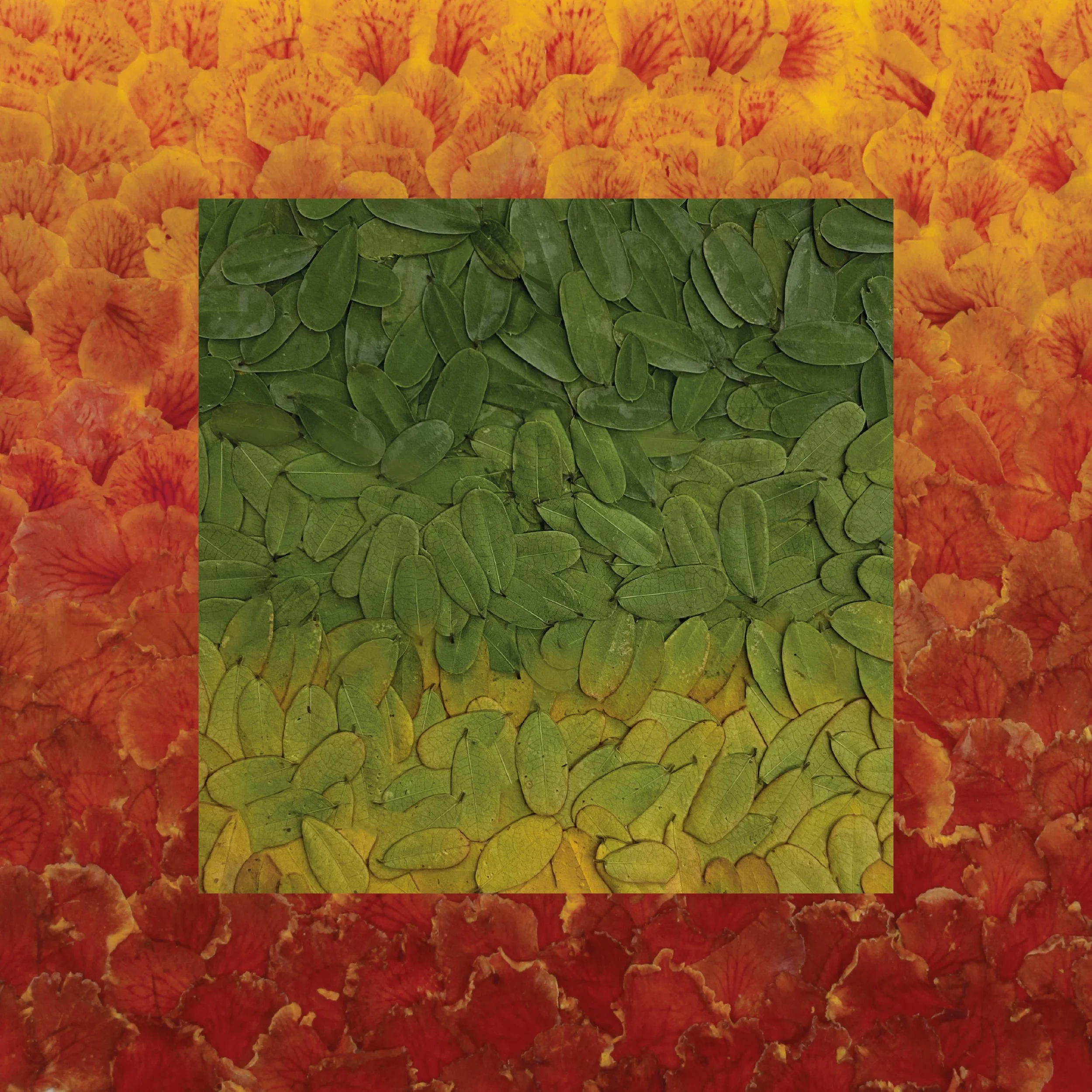
For this project, I chose to use the red Bird of Paradise carnation flower as the primary subject for my gradation study. These flowers were carefully selected for their vibrant, dynamic colors, which provided a unique challenge in capturing the subtle transitions between hues. By experimenting with drying, pressing, and exposing the petals to sunlight to allow their colors to naturally fade, I was able to document the intricate shifts in value. This entire process spanned just over two months.

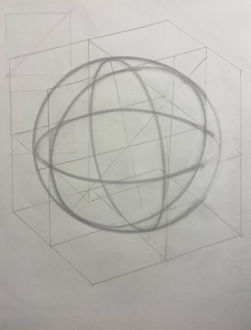
Perspective drawings
Drawing objects into 3D perspective
For this drawing, I decided to challenge myself by choosing a more complicated object than the assigned wine glass. I worked on measuring and translating the proportions from a 2D sketch on the left side of the paper into a upscaled 3D perspective. Everything here is drawn freehand without rulers, straight edges, or erasing. To maintain clarity and precision, my pencil was sharpened into a chisel shape using a blade, which had to be frequently sharpened after every few lines to ensure a thin, consistent line quality throughout the drawing.
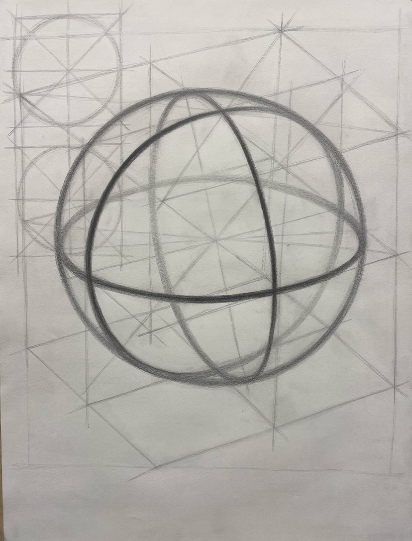
COmplex object drawing


For this sphere drawing project, I began by sketching three ellipses to represent the form in perspective. A fourth circle was then drawn on the outside, touching the outer edges of the inner ellipses, which helped create the illusion of a perfect sphere. To enhance the 3D effect, I emphasized the ellipses, adding shading and contrast to give the drawing depth.
Sphere drawing


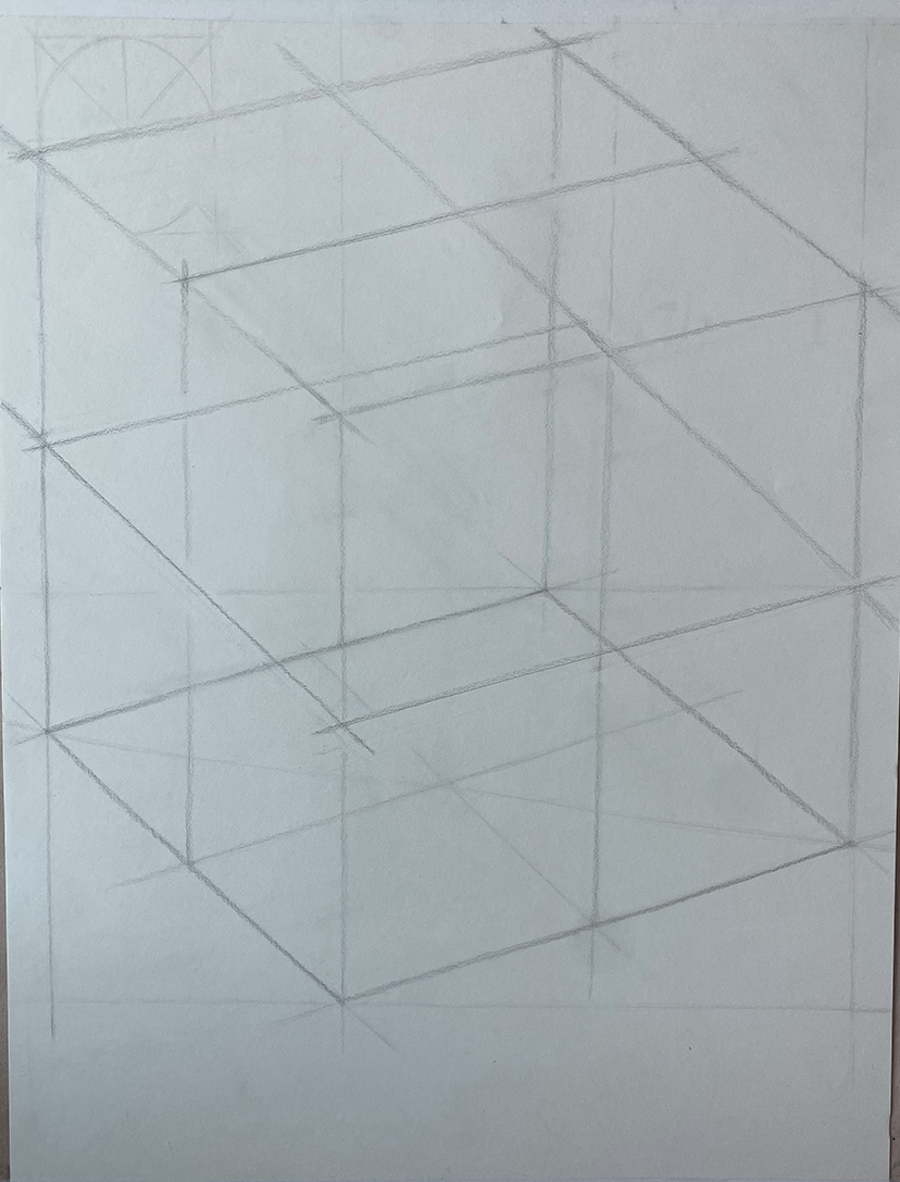
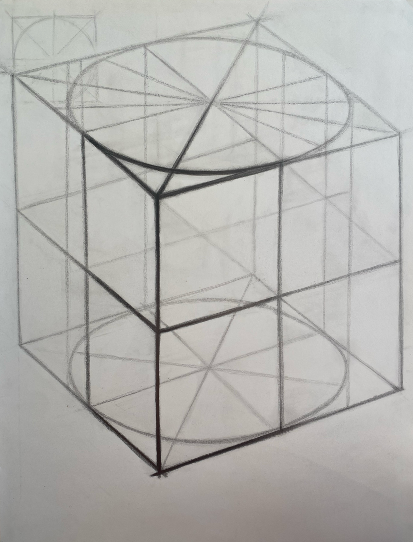
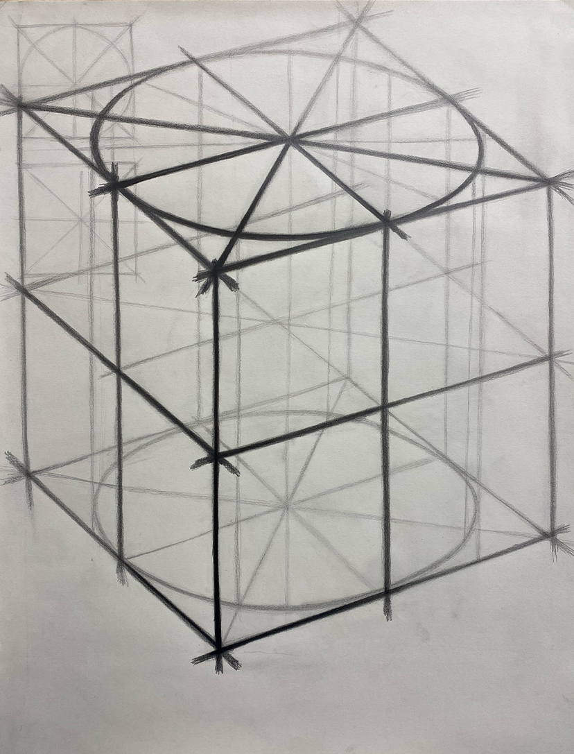
For my cube drawing project, I placed a styrofoam cube on my desk at a 45-degree angle, about an arm's length away. I then emphasized the parts of the cube closest to me, adding shading and contrast to create a strong 3D illusion.
Cube drawing

In my plane project, I drew a flat plane and transformed it into a 3D perspective. By adjusting the angles and adding depth through shading, I created the illusion that the plane was extending into space, giving it a more dynamic and realistic appearance.
plane drawing

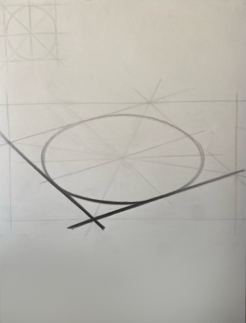

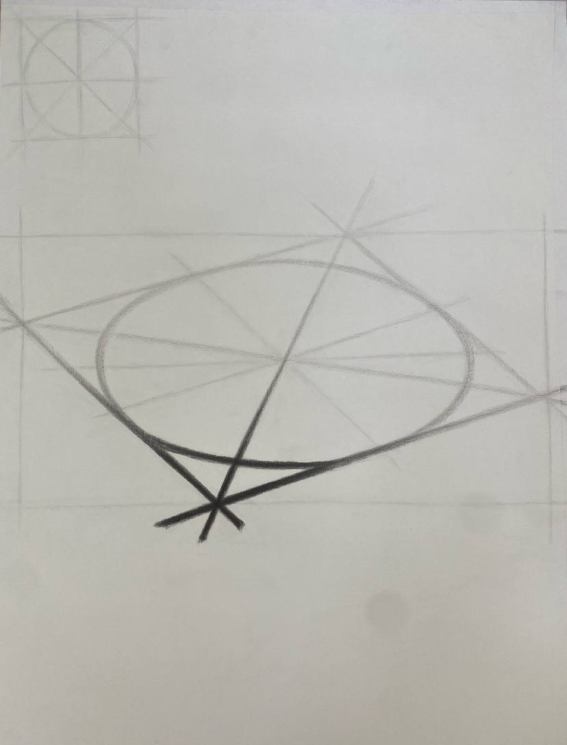
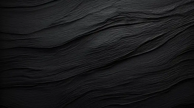

Photo combination
Finding two different images that have the same visual look when compared next to each other
The challenge was to find two different images that created a line that flowed together naturally, creating a cohesive, uninterrupted match. This required careful attention to the shapes, textures, and even reflections of the line to ensure they aligned perfectly when placed together.
Line continuation

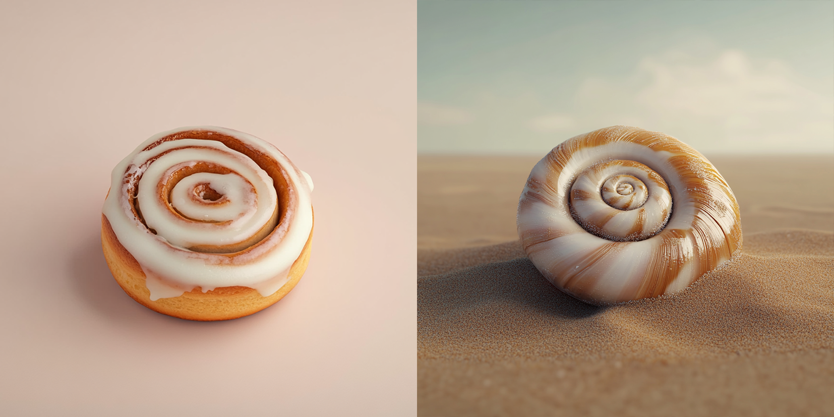
Finding two different objects that are different in scale, texture, and color but visually appear the same when compared
COmparison of form

Finding two completely different textures that visually appear the same when compared to each other
